Sloppy Finish

This week’s blog post is going to be a special one.

And by “special” I mean even more boring than the ones before – or more interesting, depending on your outlook and your role in game development -, because it deals with the phase of production that can be the most scary and the most mundane at the same time: The homestretch; the finish line; the final stage.

At this point, apart from minor things, the game is basically done – speaking in terms of all the game mechanics and systems being in place. What is far from done, however, is the art.

I still have fully-colored animation cycles of both enemy types to deliver, additional sprites for the main character, the entire GUI still has to be done, with a title screen, victory/game-over screen, pause menu, buttons, a logo – and many, many more little things here and there.

Being the Art Director, I would really like to start diving into those details now and, specifically, try to fine-tune and polish all the artwork connected to player movement and collision, to make the game aesthetically “smooth” and sound. Which is, if you ask me, the hardest but most important duty of art/graphics in games. Graphics connect the player with the game’s mechanics. Together with the controls, they are meant to suck the players in and make them become one with the Player character (PC). Interfacing. So they have to be pleasant-looking, intuitive and unobtrusive while still being informative and fitting to the setting/IP.

I gave some general directions, like red-tinted texture flickering when getting hit, hit-stun with a little sprite shake, maybe some invisibility frames after getting hit, maybe a little stun-lock or knock-back to give better feedback of getting hit while flying on a broomstick (which the PC does) and losing momentum… but that is exactly the problem of this. So many of these decisions flow into Game Design territory and, me not being Lead Designer, I can only say so much. Me and the game’s Designer are generally on the same page and if not, we might have some fruitful discussions – but at the end of the day, the final decisions are up to him and the Producer. And you can’t argue taste.

So, dealing with those creative differences, with the changes resulting out of those, adapting them, combined with bearing all the graphical workload, tasks coming up at inconvenient moments (mostly assignments from Art class, that have to be calibrated to my project schedule, otherwise I wouldn’t get anything done) is making everything extra-hard and not as satisfying as I would have hoped going into the project, when I was wide-eyed and looking forward to be Lead Art.

One thing is always stealing focus from the other and I don’t feel like I am making any progress. I also doubt that I am learning a lot about my role in a production right now, because I am constantly cooking five meals at once… and I burn them all. I just wish I had the time to sit down and read a recipe or two, try things out… What is a knife? Spork?? But there’s no time – gotta keep cooking! Or isbthat the lesson?

Sometimes, I feel like I am drowning. Because, as a perfectionist (I know, that’s my problem), this type of constant makeshift work, prominently displayed through the whole development process, deeply saddens me.

I want time.

I want knowledge.

I want more budget. (In this case: more than 1 person in the art department. To do more interesting things, learn from each other, spitball, etc.)

Overall, everything I do, feels rushed, underdeveloped and sloppy. If it finally turns out like that, we will see. Until then, I will give my best to polish all the details to a degree that is adequate to the scope and budget of the project, and at least some competency shines through my work.

I apologize for getting a bit gloomy at the end and overall not very specific or scientific in this post… but I guess, that is what naturally comes with this part of the development cycle – fear and desperation. For some, at least. For others… boredom.

What kind of dev are you?

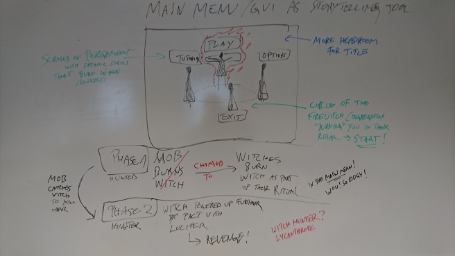
Oh, and here is a picture from when I was conceptualizing the GUI with my Lead Designer – one of my favorite moments of the entire development process! 🙂

main menu

Highly scientific color stuff


So, as mentioned in last week’s blog post, I will go into the colorization process of some of my sprites this time. Doing so, I will also refer back to my first article about the style and character concept creation of Burn Witch Burn’s protagonist, the hunted fire-witch Izalith. [So, if you are REALLY interested in this, you might want to check it out first. But then again, who cares… about anything… anymore… Yes, my grim attitude might result from me being the sole artist on this project and slowly drowning in the darkness that will inevitably consume us all. See you, when the ever-growing void in all of us implodes and you realize that nothing really matters – and nothing ever did or will.]

I talked about my inspirations and aspirations of the game’s visual style and attached some concept sketches of Izalith to show how all those abstract thought processes that precede actual asset production started to take form. Well, here we are now several weeks later, and I realized that I didn’t show you the finished main sprite for Izalith yet – even though I talked about it here and there. I know, the waiting must have been driving you insane!

[WARNING: Although nothing matters to me anymore, I gotta admit that the sprite is extremely good and knowing that is the last thing that keeps me clinging to this mortal coil. So yeah,… it’s pretty good. You might wanna sit down. Who reads blogs while standing up, aynways?! Weirdo…]

izalith

[Sorry for the insult earlier. I hope, you still liked the pic, lol]

As I announced in my first blog post (and probably some sprint meeting with my team), I went with line-heavier pen-and-paper sketching style, like in e.g. Tove Jansson’s Hobbit or Kentaro Miura’s Berserk, but tried to turn it down on the line-heaviness as much as possible (for budget reasons). In combination with some simplistic coloring techniques, I tried to close the gap towards something like Mike Mignola’s Hellboy or Frank Miller’s DK2, ending up with something in the vein of Red Hook Studios’ Darkest Dungeon. I hope. This was the kind of “cartoony art style” (GDD) I can stand behind for witch-burnings.bg2

So, as you, the avid reader, might probably have noticed in last week’s post, I went with quite a pale color scheme. For this project, I wanted to go with somewhat of a “moonlit atmosphere”, like in those magical nights when the moonlight is strong enough for there to be color in the world – even if only a little bit. And there still is plenty enough room for those stark, flat-black shadows in those really dark parts, where no moonlight reaches (like under the farmers’ hats, and for the contact shadows and some yet undecided spots, which I will add later). The blue-tint typical to moonlit scenes will be added and adjusted via Unity later, while the fiery protagonist and flames will get a orange(ish)-tinted corona. But we’ll see…farmer_frontback

The paleness might seem to be slightly more reflected in the enemies than in tree2the protagonist, but I decided upon that for the sake of telling them apart indubitably.

Coloring was, therefore, more about finding the right color tones and shades, which meant tons of lurking around in the lower levels of the brightness and saturation scales in Photoshop. So spooky! I aimed to sensibly link the paleness or brightness of colors that I use to the characters/artifacts, with the protagonist popping out as the “most colorful”, the background being the least intrusive and the enemies with all their earthy tones being somewhere in-between, while still trying to keep it cohesive.tree1

To not overdo it on the details, I wanted to keep shading simple: One color tone per surface (let’s say a brown for tree bark) plus one shade (in the tree bark’s case, a darker brown) to create some volume for the objects at hand. This way, the thick black outline that surrounds basically every colored surface, also always creates the darkest “finish” to every scale of shades.

Apropos “finish”…

Stuff, mostly background-related, very interesting

I’ll say it right away, as it is: I don’t really (want to) have a clear structure or overarching topic or theme for this week’s post, it is more of a recounting of what happened the week after what happened in last week’s post…

After having done the animations of my farmers and other enemies for “Burn Witch Burn” (for more information on that, see last week’s blog post), I went back to the sprite for the player character – Izalith, the fire witch that is being hunted by an angry mob.

Being the first sprite I made, she had started to appear different from the others when I revisited her. In the beginning phase of development during sprite conception, I (purposefully) took much more time with Izalith’s sprite, due to her being the protagonist and player character, and thus ended up slightly diverging from my intended style. The result was something just a little bit too clean. I had to go back to the line art, which was not easily done due to my poor organization of sprites and layers inside Photoshop. Using mostly the eraser and the standard brush in an alternating fashion, I tackled the outlines and some of the highlights/details, took out some curves, brought in more edges where I could and a dash of “unfinishedness”, characteristic of pencil sketches. I tried to visually close the gap between her and the rest of the sprite assets, as best I could.

Later, I went on to colorize her sprite, which brings me to my background artifacts and the actual background itself, whose creation and coloration made up a big part of that week. I had to produce a two background “panels”, slightly bigger than the resolution our game is aiming for (1920 x 1080), that the game would be scrolling through, constantly looping background panel 1, then background panel 2, back to 1 again, etc. Now I had to come up with a good production method to achieve this.

For that, I drew the first background panel, copied it, tripled the vertical size of my canvas in Photoshop, placed one copy of the panel on the very top and one on the very bottom of the canvas. This meant, I had the exact space in between the two to draw the missing second background panel and make sure they properly connect on all ends. After that, I removed the unnecessary duplicate of layer one – et voilà: an infinitely scrolling background. I felt pretty smart after figuring that out.

bg2.png

bg1
BG panels 1 & 2 (I wanted to add another copy of 1 after 2 to show the unbelievably smooth transition when looping them, but WordPress does not let me. It made me sad.)

These are the little achievements, little moments of joy for old people like me, just starting to work with Photoshop, so please don’t judge!

I feel this is a good ending point for the post (mostly to concisely and comprehensively contain the boring stuff in one article) and I will probably go into the coloring of my sprites and artifacts next week. See you then!

Animating a farmer

In this week’s post, I want to talk about an animation I made for “Burn Witch Burn” about two weeks ago (more info on the game in last week’s post and probably coming ones).

For my first two animation cycles and their respective sprite-sheets, I opted to focus on the farmer-type enemy first, as they are the most prevalent enemies. Me being the only one in the graphics department of my team, I must focus on the most quintessential graphical elements of a shmup, the enemy design and the environments, so starting with animations for the most common enemy type seemed reasonable.

The farmer is present in both phases of the game (the “Hunted phase” and “Hunter phase”, when the tables turn), trying to gang up on the player and poke them with their pitchforks. In the first phase, they will also appear in form of a “mob”, which comes with its own mechanics, but it will probably mostly consist of farmer assets.

I gave walking and attacking animations the highest priority. The idle state of a character you can scrap if necessary (due to time constraints, etc.) and dying animations you can cleverly work around with effects, again, probably even in Unity itself – I will figure that out during the coming sprints. Point being, I should consider the worst-case scenario at all times.

That is also why I chose to depict my farmer facing the player/camera – if everything would break down, we would at least have enemies with discernable faces and thus, personality.

As a side note, while designing the characters, I decided to give all the different enemy types different types of hats, while keeping the protagonist deliberately “hat-free” to both break the boring convention of witch with black hat and at the same time create an intuitively perceptible contrast to the antagonistic forces that come towards the player.

Both my walking and my attacking animation are kept deliberately crude, with walking counting 4 frames, attack counting 5-6 frames (depending if idle is in there or not). This may sound like an excuse, I realize, but I should consider that I have to work on at least two other directions for the same animation cycles (not even mentioning all the others), one facing upwards in-game (their back is turned to the player/camera) and one sideways, which I can then mirror for the opposing direction, if I run into time constraints. This is more of a problem for Âľ top-down games, which side-scrolling game projects for example may not encounter.

farmer_attack

Implementing the frames into Unity and creating the animations worked fine after some initial technical hiccups (frame-PNGs not being able to be dragged into the Scene, or appearing as weird heaps of black tangled lines). In the “Animation” tool, I enjoyed playing around with the frames that I had. At some point, I figured out useful details like e.g. keeping the forward-poke frame of the attack animation in for a longer time (or double it) for a more impactful thrust or changing around the sequence of walking frames in ways that I did not consider before.

Earlier, while painting the frames in Photoshop, I came up with the idea of using the enemies’ white eyes, which would pop out amongst the facial shadows created by the hat, to telegraph their incoming attack during the wind-up frames, so the player has a chance to teleport away in time. In practice, I feel that it did not work as intended and I will tinker with that in the future. Same goes for the character’s centers of gravity, which seems to be more the head right now than one of the feet – I still have to work on that and figure out a way to effectively implement that in my future production pipeline.

Character concept for a “hot” witch

A few weeks ago, we were given the task to choose from a variety of game concept documents and adapt one concept into a fully-fledged design, to then be developed into a playable digital game during the current semester. All the game concepts were made by us students in teams and presented/pitched to each other earlier as part of the previous semester’s course plan.

Our team chose “Burn Witch Burn”, a concept about a witch being hunted that turned out to be quite popular and was picked by a lot of other groups.

At first, I was disappointed by the lack of varying concepts that were strong enough to stick out and hook other creative minds to pick and play around with them. The concepts emerged under specific conditions and limitations, but there was room for further interpretation of the imposed themes and the linked mechanics/narrative (which were: 2D top-down shooter with PC controls, the theme being “The hunter becomes the hunted”). So I tried to focus on looking forward examining all the variant incarnations of the same given source material and aspiring to create something that hopefully manages to be distinct.

When we started adapting, I knew right away that the jolly and colorful pseudo-Anime look paired with a fast-paced Irish folk/rock soundtrack, in a 1600s-Scotland-inispired setting for a narrative that deals with witch hunts, trials and their gruesome burnings had to be changed. Despite displaying an assortment of interesting elements that initially drew the attention of many teams, this hodgepodge of influences and styles seemed – after a closer look at all conceptual documentation – too muddled and thoughtlessly thrown together, ultimately incoherent and not successfully tailored to any specific audience.

After some initial meetings, I was designated as the Lead Art and possibly Lead Sound (because our team lacks a member with any significant experience in the sound department, but I made movies once, so… yeah, good enough.) Visually, I wanted to lean towards fantastic renditions of Victorian era aesthetics, with a horror vibe to it, as you would see in work related to Stoker’s, Shelley’s or Lovecraft’s material, the Castlevania series, Bloodborne, Darkest Dungeon, Magic: The Gathering’s “Innistrad” plane, and the likes. The Lead Designer described his vision of the game world as decaying, with a presence of evil, a presence of the devil, even. My co-artist suggested to look at a picture by Tove Jansson and consider the torch-lit atmosphere of the drawing. I figured, the sketchy

blog1
Tove Jansson’s interpretation of The Hobbit, 1962

black-and-white look, line-heavy with stark, defined shadows, would be at the same time reasonable enough to pull off for two artists, and effective in its simplicity. Putting colorful lighting effects for shots, hits, specials, etc. into such an environment would make them quite impactful. I also considered pulling inspiration from Kentaro Miura’s work on the “Berserk” manga series, as a dark fantasy manga style would thematically fit better with the game than a jolly pseudo-Anime look. Ultimately, I decided that it would be too busy on screen and too work-intensive – which turned out for the better:

My co-artist left the team, the studies and the country and I was left alone with all asset creation. I had to rethink the design principles and rejigger the style guide of the game to fit the newly limited budget in (wo)man-hours. I figured that a mixture between the line-heavier styles and something with more flat, solid black shadows (think Frank Miller, Mike Mignola, Darkest Dungeon), could be feasible for one person.

blog2
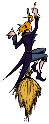
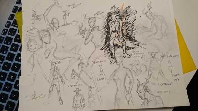
Out came my re-design of the witch, the protagonist of our game. I, personally, called her Izalith – as an homage to Dark Souls’ sub-plot about a circle of fire-witches.

blog3
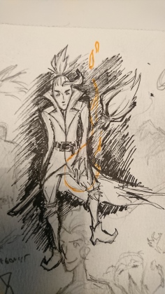
She is the last Firekeeper (another nod) in a Victorian-like fantasy world that is slowly being devoured by Darkness. People, in their desperation, have turned to superstition and made the witches scapegoats for the seemingly inevitable fate of the world. Their pyromantic powers escape the common people’s understanding and they make the “witchcraft” responsible for their doom. They fear it. And so, they hunt down, torture and murder witch after witch, to the very last light of their life…

Izalith has been tracked down by an angry mob of bloodthirsty farmers and townsfolk! Time to flee, Firekeeper! Keep the light alive and maybe… if you should get caught… make a pact with “The Lightbringer” to turn the tables…